In our last blog post we introduced our problem set, loaded in our data, and performed some initial review and preparation. This week, let's dig into the data a bit more and get a sense for what we're working with - this process is called Exploratory Data Analysis.
To review last post's progress, we:
- prepared our environment
- loaded our base data
- took a high level look at the data
- formulated some initial impressions about what we're working with
- split our data into a train set and a test set
In this post, we will clean up our data, and explore it a bit more to develop the baseline understanding that we need to develop an effective model.
Clean Data
First things first, let's clean up the data that we loaded at the end of last week.
Drop Data
The primary thing that we will do is remove data that we don't want to work with.
Some of our data sources may not contain values for Alaska, Hawaii, or Puerto Rico - in particular, it easier to work with Multi-Resolution Land Characteristics data for the continental United States, than to include Alaska, Hawaii, and Purto Rico. To simplify the problem set a bit, let's remove data from those states from both our train and test sets.
for key, dataframe in fires_df.items():
    drop_index = fires_df[key][
        (fires_df[key].STATE == "AK") |
        (fires_df[key].STATE == "PR") |
        (fires_df[key].STATE == "HI")].index
    fires_df[key].drop(drop_index, inplace=True)
Since we're building a model to predict the cause of a wildfire, fires whose cause is unknown to us is not very interesting. Let's drop it.
for key, dataframe in fires_df.items():
    drop_index = fires_df[key][
        (fires_df[key].STAT_CAUSE_CODE == 9.0) |
        (fires_df[key].STAT_CAUSE_CODE == 13.0)].index
    fires_df[key].drop(drop_index, inplace=True)

stat_cause_mapping.drop([9.0, 13.0], inplace=True, errors='ignore')
Exploratory Data Analysis
Now that we have cleaned up our data a bit, let's get to work exploring and learning about what we're working with. Through Exploratory Data Analysis, we'll employ visual techniques to summarize some key characteristics of the data that we're working with. In particular, let's look at:
- Cause
- Day of Year and Cause
- Owner
- Owner and Cause
- State
- State, Geographic
- State and Cause
Cause
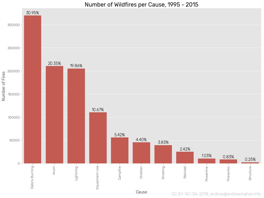
Let's explore the causes of wildfires represented in our dataset.
counts_by_cause = fires_df["train"].groupby('STAT_CAUSE_DESCR')\
    .size()\
    .sort_values(ascending=False)
counts_by_cause_pcts = counts_by_cause.apply(lambda x: 100 * x / float(counts_by_cause.sum()))

plt.figure(figsize=(15,10))
ax = sns.barplot(counts_by_cause.index, counts_by_cause.values, color=qual_colormap.mpl_colors[11])
ax.set_xticklabels(labels=counts_by_cause.index, rotation=90)

for i, p in enumerate(ax.patches):
    height = p.get_height()
    width = p.get_width()
    ax.text(
        p.get_x()+(width/2.),
        height + 3000,
        '{:1.2f}%'.format(counts_by_cause_pcts[i]),
        ha="center")

plt.title('Number of Wildfires per Cause, 1995 - 2015', fontsize=20)
plt.xlabel('Cause')
plt.ylabel('Number of Fires')
plt.annotate('CC BY-NC-SA, 2018, andrew@andrewmahon.info',
    xy=(1, 0),
    xycoords='axes fraction',
    xytext=(0, -100), textcoords='offset points',
    ha='right', va='top',
    color='#BEBEBE'
)

plt.show()
Day of Year and Cause
Let's have a look at when during the year wildfires are discovered. We'll break it out by cause to try and identify any large trends.
Let's create a new df, cause_by_doy, that relates STAT_CAUSE_DESCR to DISCOVERY_WEEK. We'll use that to calculate a total for each day, and then create a secondary df, cause_by_doy_proportional, that contains the proportion of fires with each cause for each day.
cause_by_doy = fires_df["train"].groupby(['DISCOVERY_DOY', 'STAT_CAUSE_DESCR'])\
    .size()\
    .unstack()
causes = list(cause_by_doy.columns.values)
cause_by_doy['Total'] = cause_by_doy.sum(axis=1)

cause_by_doy_proportional = pd.DataFrame()
for cause in causes:
    cause_by_doy_proportional[cause] = cause_by_doy[[cause, 'Total']].apply(lambda x: x[cause]/x['Total'], axis=1)
cause_by_doy = cause_by_doy.drop('Total', axis=1)
display(cause_by_doy.head(10))

ax = cause_by_doy.plot.area(figsize=(15,  7))
ax.set_xlim(0,367)
ax.set_ylim(0,10000)

plt.title('Number of Wildfires per Day of Year over Cause, 1995 - 2015', fontsize=20)
plt.xlabel('Day of Year/Cause')
plt.ylabel('Number of Fires')
plt.annotate('CC BY-NC-SA, 2018, andrew@andrewmahon.info',
    xy=(1, 0),
    xycoords='axes fraction',
    xytext=(0, -50), textcoords='offset points',
    ha='right', va='top',
    color='#BEBEBE'
)

plt.show()| STAT_CAUSE_DESCR | Arson | Campfire | Children | Debris Burning | Equipment Use | Fireworks | Lightning | Powerline | Railroad | Smoking | Structure |
|---|---|---|---|---|---|---|---|---|---|---|---|
| DISCOVERY_DOY | |||||||||||
| 1 | 409.0 | 87.0 | 178.0 | 727.0 | 143.0 | 39.0 | 16.0 | 10.0 | 48.0 | 85.0 | 5.0 |
| 2 | 367.0 | 40.0 | 102.0 | 619.0 | 138.0 | 7.0 | 12.0 | 7.0 | 34.0 | 58.0 | 2.0 |
| 3 | 355.0 | 49.0 | 52.0 | 572.0 | 164.0 | 2.0 | 15.0 | 7.0 | 51.0 | 60.0 | 2.0 |
| 4 | 326.0 | 51.0 | 54.0 | 555.0 | 119.0 | 10.0 | 8.0 | 19.0 | 55.0 | 60.0 | 3.0 |
| 5 | 371.0 | 45.0 | 69.0 | 634.0 | 180.0 | 2.0 | 9.0 | 13.0 | 44.0 | 77.0 | 6.0 |
| 6 | 321.0 | 42.0 | 61.0 | 660.0 | 134.0 | 4.0 | 13.0 | 10.0 | 68.0 | 56.0 | NaN |
| 7 | 381.0 | 51.0 | 58.0 | 701.0 | 170.0 | 3.0 | 6.0 | 16.0 | 61.0 | 75.0 | 2.0 |
| 8 | 388.0 | 60.0 | 66.0 | 729.0 | 156.0 | 3.0 | 8.0 | 10.0 | 43.0 | 55.0 | 5.0 |
| 9 | 288.0 | 54.0 | 43.0 | 552.0 | 158.0 | 1.0 | 17.0 | 9.0 | 68.0 | 54.0 | 1.0 |
| 10 | 304.0 | 45.0 | 33.0 | 594.0 | 142.0 | 2.0 | 14.0 | 3.0 | 53.0 | 58.0 | NaN |
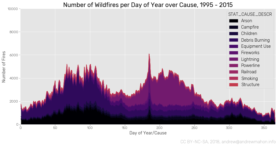
Very interesting! A couple of observations:
- Debris Brurning and Arson are well represented in the first third of the year, and then trickle off.
- Lightning is the predominant cause of fire for the summer months.
- The days around July 4 see an increase in fires of all causes.
Let's plot this as a heatmap to further confirm what we're looking at. We'll use the proportional values to reveal the relationship between causes for each day.
plt.figure()
ax = sns.heatmap(
    cause_by_doy_proportional,
    cbar_kws={'shrink':.9 },
    annot=False,
    cmap=quant_colormap.mpl_colormap
)
for i, label in enumerate(ax.yaxis.get_ticklabels()):
    label.set_visible(False)
    if i % 7 == 0:
        label.set_visible(True)

plt.title('Wildfire Causes per Day of Year, Proportional, 1995 - 2015', fontsize=20)
plt.xlabel('Cause')
plt.ylabel('Discovery Day of Year')
plt.annotate('CC BY-NC-SA, 2018, andrew@andrewmahon.info',
    xy=(1, 0),
    xycoords='axes fraction',
    xytext=(0, -125), textcoords='offset points',
    ha='right', va='top',
    color='#BEBEBE'
)

plt.show()
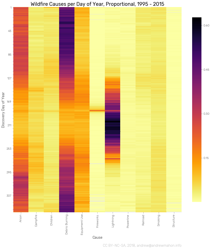
Wow, we're seeing a strong relationship between Discovery Day of Year and a couple of Causes. In particular, the relationship between DOY and Lightning and Fireworks fires is quite strong.
Owner
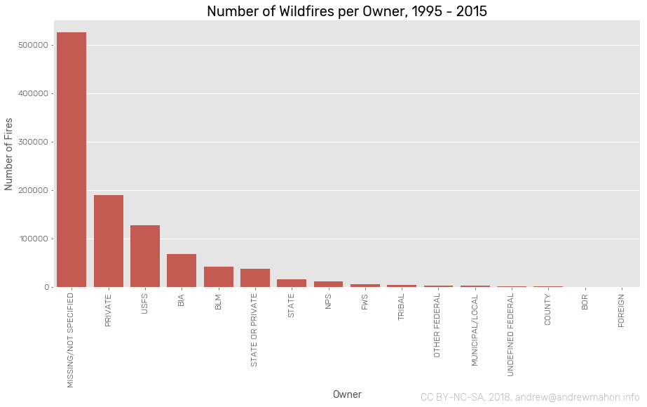
Let's have a look at who owns and manages the land where fires begin.
We'll start by looking at the number of fires per land owner.
plt.figure(figsize=(15, 7))
counts_by_owner = fires_df["train"].groupby('OWNER_DESCR')\
    .size()\
    .sort_values(ascending=False)

ax = sns.barplot(counts_by_owner.index, counts_by_owner.values, color=qual_colormap.mpl_colors[11])
labels = ax.set_xticklabels(labels=counts_by_owner.index, rotation=90)

plt.title('Number of Wildfires per Owner, 1995 - 2015', fontsize=20)
plt.xlabel('Owner')
plt.ylabel('Number of Fires')
plt.annotate('CC BY-NC-SA, 2018, andrew@andrewmahon.info',
    xy=(1, 0),
    xycoords='axes fraction',
    xytext=(0, -150), textcoords='offset points',
    ha='right', va='top',
    color='#BEBEBE'
)

plt.show()
Owner and Cause
Let's break out each owner by the cause of fires on the land they administer and plot as a heatmap.
cause_by_owner = fires_df["train"].groupby(['OWNER_DESCR', 'STAT_CAUSE_DESCR'])\
    .size()\
    .unstack()

plt.figure(figsize=(15, 15))
ax = sns.heatmap(
    cause_by_owner,
    cbar_kws={'shrink':.9 },
    annot=False,
    cmap='inferno_r'
)

plt.title('Wildfire Cause per Owner, 1995 - 2015', fontsize=20)
plt.xlabel('Cause')
plt.ylabel('Owner')
plt.annotate('CC BY-NC-SA, 2018, andrew@andrewmahon.info',
    xy=(1, 0),
    xycoords='axes fraction',
    xytext=(0, -125), textcoords='offset points',
    ha='right', va='top',
    color='#BEBEBE'
)

plt.show()
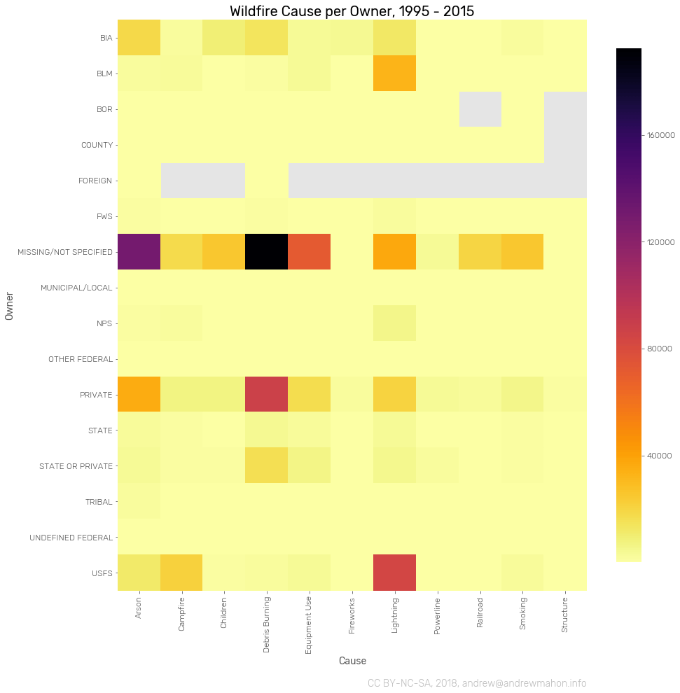
Hmm -- a couple interesting revelations, but nothing too strong. Of note, we see that fires caused by lightning primarily occur on USFS land. Debris Burning is a primary cause of fire on Privately Owned land. Broadly speaking, the volume of untagged data (fires who's land owner is "Missing/Not Specified"), makes it challenging to really understand what we're looking at through the lens of land owner.
Additionally, it may be worth engineering some new features around OWNER. Some of the categories present are not well defined or provide some overlap - perhaps we could clean these categorizations up to derive more insight.
State
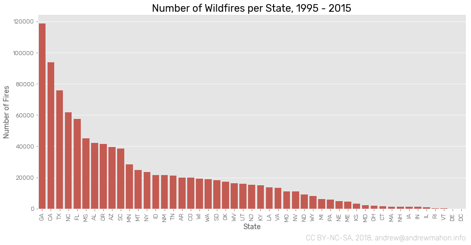
Let's look at where in the country wildfires occur. We'll stary by looking at total number of fires per state.
counts_by_state = fires_df["train"].groupby('STATE')\
    .size()\
    .sort_values(ascending=False)

plt.figure(figsize=(15, 7))

ax = sns.barplot(counts_by_state.index, counts_by_state.values, color=qual_colormap.mpl_colors[11])
labels = ax.set_xticklabels(labels=counts_by_state.index, rotation=90)

plt.title('Number of Wildfires per State, 1995 - 2015', fontsize=20)
plt.xlabel('State')
plt.ylabel('Number of Fires')
plt.annotate('CC BY-NC-SA, 2018, andrew@andrewmahon.info',
    xy=(1, 0),
    xycoords='axes fraction',
    xytext=(0, -50), textcoords='offset points',
    ha='right', va='top',
    color='#BEBEBE'
)

plt.show()
State, Geographic
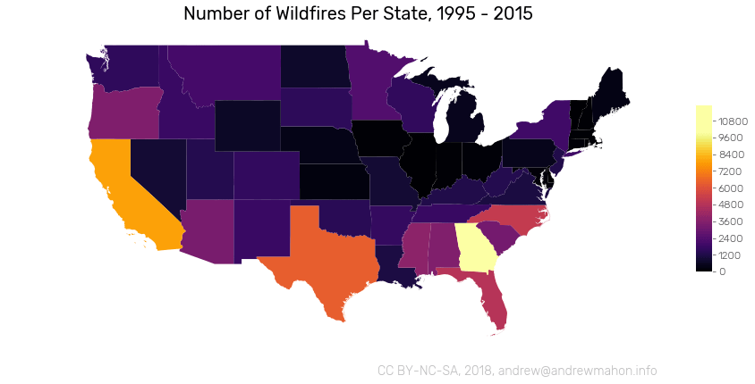
Let's render number of fires per state on a map. We can use GeoPandas here to help us out. We'll load in some outlines from http://eric.clst.org/tech/usgeojson/, and a set of 2 character abbreviations. We'll join those two, and then join the resulting frame to counts_by_state from above. Don't forget to drop Alaska, Hawaii, and Purto Rico from our newly imported data.
state_outlines_path = '/data/188-million-us-wildfires/src/gz_2010_us_040_00_500k.json'
state_outlines_df = gpd.read_file(state_outlines_path).set_index("NAME")
state_outlines_df.drop(['Alaska', 'Hawaii', 'Puerto Rico'], inplace=True)

state_codes_path = '/data/188-million-us-wildfires/src/state_codes.json'
state_codes_df = pd.read_json(state_codes_path, orient='records').set_index('name')
state_codes_df.drop(['Alaska', 'Hawaii', 'Puerto Rico'], inplace=True)

states = state_outlines_df.join(state_codes_df).set_index('alpha-2')

states_map = states.join(counts_by_state.to_frame().rename(columns={0:'count'}))\
    .to_crs({'init': 'epsg:3395'})

plt.figure()

ax = plt.subplot(111)
ax.set_aspect('equal')
states_map.plot(
    ax=ax,
    column='count',
    cmap='inferno')
plt.axis('off')

plt.title('Number of Wildfires Per State, 1995 - 2015', fontsize=20)
plt.annotate('CC BY-NC-SA, 2018, andrew@andrewmahon.info',
    xy=(1, 0),
    xycoords='axes fraction',
    xytext=(0, -15), textcoords='offset points',
    ha='right', va='top',
    color='#BEBEBE'
)

norm = mpl.colors.Normalize(vmin=0,vmax=10000)
sm = plt.cm.ScalarMappable(cmap='inferno', norm=norm)
sm.set_array([])
plt.colorbar(
    sm,
    ax=ax,
    ticks=np.linspace(0,12000,11),
    boundaries=np.arange(0,12000,10),
    shrink=0.23,
    aspect=10
)

plt.show()
State and Cause
Let's pivot out Cause, and have a look at what causes fires in each State.
cause_by_state = fires_df["train"].groupby(['STATE', 'STAT_CAUSE_DESCR'])\
    .size()\
    .unstack()
causes = list(cause_by_state.columns.values)
cause_by_state['Total'] = cause_by_state.sum(axis=1)
cause_by_state_proportional = pd.DataFrame()
for cause in causes:
    cause_by_state_proportional[cause] = cause_by_state[[cause, 'Total']].apply(lambda x: x[cause]/x['Total'], axis=1)
cause_by_state = cause_by_state.drop('Total', axis=1)

plt.figure()
ax = sns.heatmap(
    cause_by_state,
    cbar_kws={'shrink':.9 },
    annot=False,
    cmap='inferno_r'
)
plt.title('Cause of Wildfires by State, 1995 - 2015', fontsize=20)
plt.xlabel('Cause')
plt.ylabel('State')
plt.annotate('CC BY-NC-SA, 2018, andrew@andrewmahon.info',
    xy=(1, 0),
    xycoords='axes fraction',
    xytext=(0, -100), textcoords='offset points',
    ha='right', va='top',
    color='#BEBEBE'
)

plt.show()
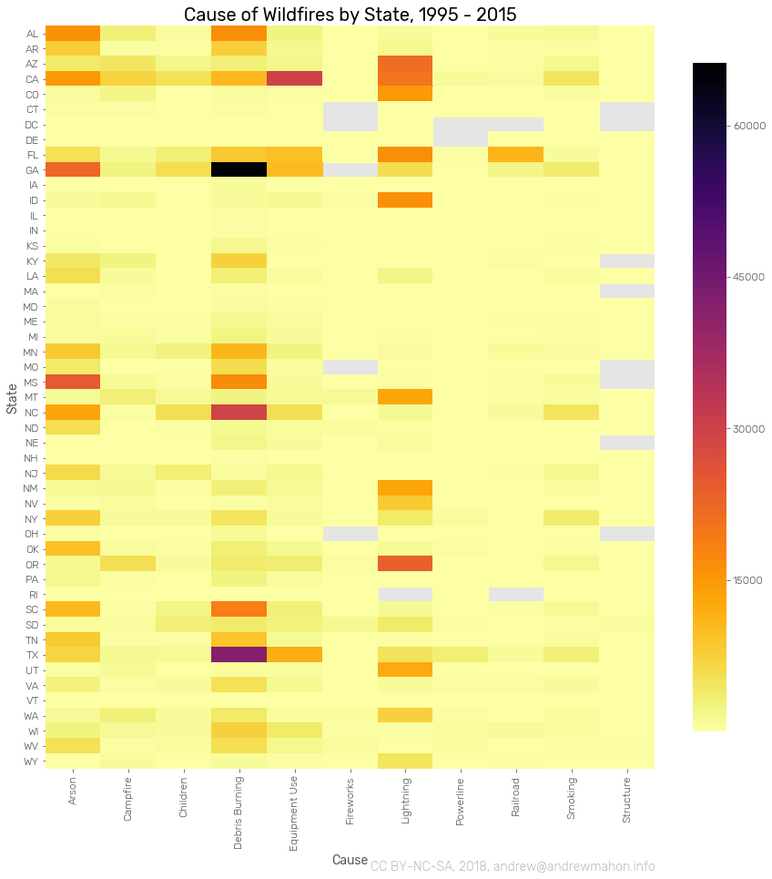
A couple of observations about the geography of wildfires:
- Debris burning seems to cause a disproportionate number of fires in Texas and the southeast.
- Lightning predominantly affects western states.
- Arson seems to be somewhat geographically correlated to debris burning.
- Florida suffers from a disproportionately large number of Railroad fires.
Changes
Per usual, this post may be updated from time to time.
2018/2/13 - initial post 2018/2/26 - removed incorrectly applied analysis
Conclusion and Next Steps
That's it for now. Coming away from this initial round of Data Exploration, we can see that Discovery Day of Year, Owner, State and Longitude all have a fairly strong relationship to Cause. Let's make sure to consider those when it comes time to build our model.
In terms of a next steps, a couple things are on the agenda:
- create a higher resolution geographic visualization of the data we're working with
- engineer a couple of new datapoints, in particular, Land Cover and Weather may prove to be interesting
Per usual, this notebook can be found on github. It's a little bit of a mess right now, but I'll get it cleaned up in short order.
Stay tuned!